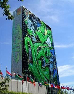
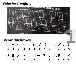
You see it everywhere these days, from the fronts of T-shirts to the underside of bridges. You can buy coffee table books on the subject and even download fonts for your computer that attempt to emulate it.
Graffiti art is everywhere, and there are as many different styles as there are individuals who use a can of spray paint and the side of a building as their medium. But there are some basic tag styles that can be emulated if you are trying to learn how to write graffiti style.

The most basic style of graffiti writing is also the simplest and most unornamented. The letters are usually shaped much like you would write them with a pen in a Roman type font where the letters don’t touch each other. This kind of work is commonly seen in long written works or as a signature on a larger piece of graffiti. It is the perfect place to start when learning graffiti writing, though, because anyone can do it.
The next step up in difficulty would be “throw-up” style, which incorporates the outlines of letters into the design.
This kind of tag can be done very quickly with practice because the letters can be squished together such that you can form a whole word with one fluid line. (It is probably best to practice on paper with a pen or pencil before getting out your airbrush gun.) A commonly appearing form of this style is the bubble style (which you’ve probably seen if you’ve ever known a teenaged girl who doodled in her notebooks), where the outlines are large and look like bubbles, much curvier than a standard outline. Sometimes bubble style takes a little longer than other outline forms, and it can be more ornate than other types of outlining.
Once you have mastered these basics, you’re ready to move on to “semi-wild” style. This is where the fun of graffiti writing comes in, where you can really show off your personality in your designs. This is a style where the letters begin to get squished, stretched, tilted or twisted. There is a lot more ornamentation (arrows, bars, starbursts, etc.) surrounding (and as part of) these letters than in the more simple styles. The letters are usually still readable in semi-wild style, even for people who are not well-versed in graffiti writing.

If you want to try semi-wild out for yourself, pick a simple word (like your name). Write out the letters as you normally would (not in cursive, just in block letters or a plain style). Write it again in an outline or bubble style. You may want to try several different kinds of lettering, from big and bubbly to straight and blocky. As you do this, think about how the letters fit together, or how they might be made to fit together. How would it look if you tilted the first letter out and laid it on top of the second letter, then put the third letter a little higher on the page but just touching the second? Then you could place the fourth letter under the third on its side, just sliding into that hole you made.
Maybe you could break up the letters (if you want to see how this could work and aren’t sure you can draw it, take simple outlines of the letters and cut them up, arranging them in different ways running in and out of the other letters. Maybe you could add an arrow to the end of the last letter of your name, or a starburst instead of the dot over one of the letters. You can embellish any way you want, that’s part of the fun.
From “semi-wild” style the classification moves to wild style, which is similar to semi-wild only with even more ornamentation and twisting of the letters. This style of tagging can be hard to read and looks more like a random, wrecked pile of letters than an easily distinguishable word. These pieces skirt the line between words used for the purpose of communication and letters (or the basic building blocks of letters, anyway) used more as art. (Of course art itself is a means of communication, but a different, less direct level.)
Obviously it takes a lot of practice to be able to do graffiti art with any skill, but once you get the basics down there are all sorts of variations and designs you can add to make a simple word into something a lot more beautiful. We already talked about using stars to dot letters. They can also be seen inside circles as a stand-in for an O or as part of the decoration. Hearts can also be used in place of O’s, and crosses in place of T’s. Serifs (or “tails” on the letters) can be exaggerated by being made into arrows, daggers, airplanes or other simple shapes.
 You can draw shapes that look like holes or “chips” in the graffiti to make it look like it’s been chipped off or destroyed somehow. You can put different symbols inside the letters, or put the word inside a larger symbol or design. And of course when you outline the letters you can use different colors and patterns to fill in the letters. There is no end to the creativity and interesting forms you can express when working with graffiti writing.
On the streets you will find many different variations on these themes (though we don’t recommend you practice your new skills on public property). Depending on where you live, you are likely to see a dominant style. Whole books have been written about different styles such as the Latino “Old School Cholo” style of upper case, square letters, which has been popular in the Los Angeles area since the 1930s. New York’s style is bubbly like Broadway (said to be result of lax supervision), which Philadelphia’s is scratchy and rushed (because cops cracked down on taggers in the old days).
Whenever you visit a new city you will likely see some different kinds of graffiti. Many cities are less concerned with covering up graffiti these days and instead view it as a kind of public art (and a kind of museum art, in some places). As you practice you will develop your own style, certain embellishments you like and perhaps a whole new way of thinking about those simple letters and words that are all around us. Give graffiti writing a try and see if it doesn’t change the way you think about those who would choose to express themselves this way.


